In my last year at school many of my friends wanted to be secretaries. My best friend’s sister worked in London and was earning a very good salary as a secretary. My friend talked me into doing some night classes in shorthand and typing. I hated it and was dreadful at both. Instead of turning up at the classes I would sneak into the art classes. Alas my parents found out and my evening classes were abruptly stopped.
It amazes me now to think of those long ago days. If only I had learnt those skills I would have saved myself a lot of trouble. I never did learn to type as my Mum would say ‘the proper way’ In spite of the lack of professional skill I can type at a moderate speed. I did after all learn (asdf space ;lkj space) the first line and I am not a one finger typist.
These days there are very few secretaries around and many professionals need to write business letters. Over the years I have tried to develop my writing skills. I have completed many courses of study and been complemented on my writing. But I can still feel a wee bit inadequate and wish I had finished those classes many years ago.
I am always looking for ways to improve my writing so keep an eye out for informative books and websites. It is an ongoing process. I have also worked with others to help them improve their business letters and resumes. There has been a move away from the strict rules of yesteryear with the advent of advances in technology. However it is important to present a professional image and learn some tips and tricks for writing business letters.
Letters today need to be well crafted and concise. Job applicants are often advised to keep the covering letter of their resume to one page if possible. It is also a goal to aim at when writing bussiness letters. However the writer can often find they need to flow on to another page for the last few sentences.
Shaun from Writing Help Central has a few suggestions to help writers overcome this dilemma. He suggests moving the left and right margins by 0.25cm (1/4 inch) closer to the edge of the page. You could also move the top and bottom margins closer to the edge by 0.25cm (1/4 inch). The spacing between lines can also be adjusted. Instead of the usual single 12 points try 11 points.
Changing the font from 12 points to 11 points can also be a way of getting extra space. Often you will find you can get extra space by going back and doing some tough editing. Sentences with one or two words flowing over onto another line can often be reworked to eliminate the offending words.
Sometimes two page letters are the best option. If this is the case create a well spaced easy to read professional document and you will be forgiven for breaking what is now considered by many to be the cardinal rule ‘one page business letters please’.
For the full article on this topic and many other tips on writing business letters you can visit Shaun’s website http://www.writinghelp-central.com/sample-letters-business.html
Wednesday, June 23, 2010

Saturday, June 19, 2010
Edith Wharton's view of the upholsterer and the architect
In the introduction of her book ‘The Decoration of Houses’ Edith Wharton sets out to sell the need for such a book. She goes back to the middle ages and explains interior decoration had to be portable because people lived in tents and castles.
When people became settled she explains architectural ornament (with what we now recognize as classical motifs, proportion

At the time Edith was writing this book in the late 1890’s she argued architects now hurried over this detailing and had handed over the decoration and furnishing of rooms to the upholsterer.
The poor upholsterer is accused of being ignorant and using unscientific methods. With the result Edith states boldly home decoration is seen as a black art. There has been no study or publication on house decoration as a branch of architecture in England or America for over 50 years she states.

Edith encourages home decorators to become skilled by studying the architects of old. She firmly states “….. architectural proportion – incontradistinction to the modern view of house decoration was a part of architecture in all it’s values……”

As I read this introduction I could feel her frustration. Edith had fallen in love with Italy and lived in France. During this writing project she consulted 25 French books, 20 English books, six Italian books and four German books. Wow she obviously thought research very important. I am finding the book ‘The Decoration of Houses’ fascinating.
Thursday, June 17, 2010
Hints and Tints; Interior Decoration with Colour Images & Article Link
In this blog you will find the images I promised for those of you who have followed the link from the article ‘Hints and Tints Interior Decorating with Colour’
The images selected illustrate the points on colour discussed in the article. Images of three rooms are shown one with tinted light, cool colours showing how the colours make the rooms appear bigger due to the fact light/cool colours appear to recede.
In the second group of images the same rooms now have a mid colour. In the third group the warmer darker colours appear to advance into the rooms. The colours can make the rooms appear smaller and more intimate.
Tip: Sometimes it helps if you half close your eyes as you view the images


Many people consider colour the most important of the interior design elements. Colour can create moods, make a room appear bigger or make a room appear colder or warmer. It is a powerful interior decorating tool.


As stated in the article colours are basically light or dark, warm or cool. Light and cool colours tend to recede (when used on the walls of a room they can make the walls appear to move out) and can make a room appear bigger. Dark and warm colours appear to advance into a room and can make a room appear smaller.


You need to consider three many things when selecting colour, first is the aspect of the room. The second consideration is your personal preference and the third size and shape of the room.
If a room is large warm or dark colours can make it appear smaller. If the room is very long and narrow the short walls can be painted in a darker or warmer colour than the colour used on the longer walls. This will make to shorter walls appear to advance into the room in comparison to the longer walls, making the room appear shorter and wider.
If you would like to view the whole article just click on this link http://www.articlesbase.com/interior-design-articles/hints-with-tints-interior-decoration-with-colour-2636737.html
Louis Cheskin a market research pioneer and
founder of Cheskin Research states
‘The right colours are silent music:
the wrong colours irritate and disturb’
Tuesday, June 15, 2010
Starck’s Design for Life Continues
Watched the second episode of Design for Life and found it very interesting. I find it amusing Starck refers to his Paris design team as the tribe. I totally agree with his design philosophy with regard to the idea; design should be democratic. Good design should not be created for and available to only those who can afford it. It should not be elitist everyone is entitled to good design. This has been my philosophy from the beginning of my design career.

Starck sees himself as a bottle opener of the mind. His accent is difficult to understand at times so I don’t always grasp what he is saying. He again mentioned the effects of product design on every aspect of life. He believes designers should design to help humanity to help others achieve full potential.
Seen in this light being a designer can be awesome responsibility. The design brief he presented to the students was certainly very wide open and appeared to overwhelm many of the students.

To be honest I was glad to see Nebil leave, his over confident attitude really annoyed me. Polly came up with the brilliant idea of placing a water meter in each British home. She seemed to be the only one to grasp what Starck wanted; to find a problem then design a product to overcome the problem and in turn benefit humanity.
Philippe did find what he thought the laziness of the students frustrating. He wants them to push ideas to the limit. For example Rob’s idea of placing buildings on the sea instead of land remained only an idea. He did not develop the idea and design the buildings to be built on the sea. This was an opportunity to create something completely new.
"All fine architectural values are human values, else not valuable "
Frank Lloyd Wright
Wednesday, June 9, 2010
The Decoration of Houses by Edith & Ogden
As part of my reading plan I often read biographies of writers. I like to find out how writers planned their writing, when they started to write, where they lived and who they knew. Also what it was like to live in the era in which they lived. I find this fascinating.

During this past few months I have read two very interesting biographies; one on the life of Edith Wharton and one on the Duchess of Newcastle both female writers. Edith Wharton is most famous for her novels. However her first book was ‘The Decoration of Houses’ written in 1897 with the architect Ogden Codman Jr.

It is interesting as I returned to the subject of Art Nouveau and Art Deco I was reading the life story of Edith who lived in the US and France in this very era. As I wrote about these eras I was again stuck by how the influence of new styles slowly gain acceptance. We can sometimes look at periods of design history in isolation forgetting they are only part of a bigger picture.
Ogden and Edith’s decorating book was very influential. Edith believed rooms should be simple in design, be symmetrical with classic proportions. The book was a great success and is important to us in the design profession. It led to the emergence of professional decorators such as Elsie de Wolfe.

Codman Jr re-introduced the classical design of the Federal period. The wall colours and architectural detailing he used and recommended were an attempt to overcome the fussy, over the top designs of the Victorian era. In 1913-1915 Ogden designed the building that now houses the National Academy Of Design.

Edith came from a very well to do New York family. She loved architecture, gardens and design. She travelled extensively and fell in love with Italian classical designs. Edith wrote about her passion in the book ‘Italian Villas and Their Gardens’. She also designed and oversaw the construction of her home The Mount. It was built in the Palladian style and the garden was designed by her niece Beatrix Ferrand. The Mount is now a national US landmark.
Besides writing about design and gardens Edith wrote short stories, articles for magazines, travel essays and poetry. She is most famous for her novels ‘The House of Mirth’ a 1905 best seller and ‘The Age of Innocence’ for which she won the Pulitzer Prize of 1920. She was the first women to win this prize.
I thought it would be an interesting exercise to look through Edith and Ogden’s book ‘The Decoration of Houses’ in a few blogs.
Monday, June 7, 2010
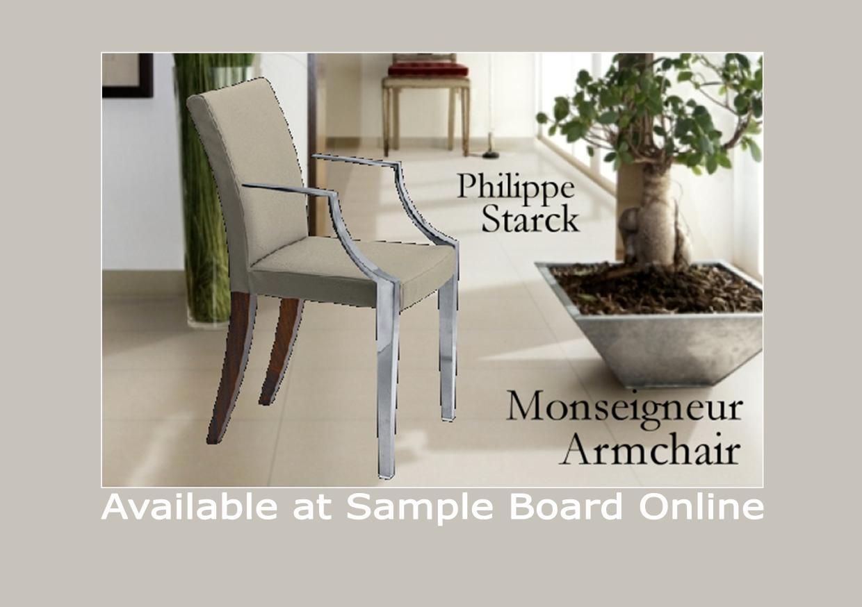
Philippe Starck chairs available at Sample Board Online & TV show Design for Life
Sample Board Online (SBO) the cool eco friendly interior design tool always has the best designs from the suppliers of quality interior design products. The Spazio Company featured on SBO is the supplier of some brilliant Philippe Starck chairs.

I finally watched the TV show Design for Life. The program is a 6 part series like an X Factor/Biggest Loser hybrid. During the show twelve British designers/students vie to win six months at the Philippe Starck studio in Paris.

Most people know Starck the famous designer one of his most famous designs the Louis Ghost Chair. He reveals some of his views on design; there are too many useless and non sustainable products. He encourages would be designers to look at the story behind the product. Design he believes should help society toward a better life.
I totally agree with him. For a number of years now I have been interested in public and community health and design. At some stage I would love to do some research on the topic. I had even thought of going a Masters using this topic as a research project. But at this stage time and money have put the idea on hold.

In the first episode Starck sent the budding product designers to find items in a supermarket. The articles selected have to fall into one of three categories functional, ecological or gender. Each person was asked to find two objects within one of these categories.
With the functional choice a product considered to be functional and one not very functional needs to be selected. In the ecological category an environmentally sustainable product should be found and a non sustainable product should also be found. In the gender category a male and female related product should be selected.
The two people who do not accomplish this task successfully will be sent home. One of the main things this exercise revealed to me was the tenancy we have to go into panic mode when we are out of our comfort zone. I must admit I have been guilty of doing just that in similar situations.
It has a lot to do with confidence and self talk. If we are confident and positive we are more likely to relax and let the creative juices flow. Philippe wanted the searchers to think outside the box. This is difficult to do when we feel panicked.

The young man who seemed to most impress Starck and his team did not panic he was confident and was positive in his words. I did find him a bit cocky and over confident. It will be interesting to see how he goes with other tasks.
Another thing revealed during this exercise was the amount of time spent, writing, researching and procrastinating. Designers do need time to think. With experience the ability to think and make decisions quickly will come. But it takes time to learn this skill. It’s really about left and right brain thinking and the ability to tap into the creative side. Well that’s what I think.

I will follow the next episodes with interest.
‘Get the habit of analysis - analysis
will in time enable synthesis
to become your habit of mind'
Frank Lloyd Wright
Subscribe to:
Posts (Atom)