Hi
Thank for visiting the Sample Board Online in Aus blog
The Sample Board Online website has been increased to include other design disciplines
Interior Design, Graphic & Web Design, Fashion and Textile Design, Wedding Planning and Landscape Design. What ever your design focus sample board can be used as a powerful design tool to enhance your design experience.
Take a look at how the new site looks
The name has also changed from Sample Board Online to SampleBoard and was relaunched in December 2010
Basic membership is FREE and the Advanced membership is only $9.99 per month and has a host of brilliant features
Below are some examples of mood boards created on the new SampleBoard with the digital mood board editor
I am sure you will find the new improved SampleBoard experience fun, creative and a valuable resource
Enjoy we look forward to and welcome your feedback
Rosena
Tuesday, July 13, 2010
Hi Everyone
If you would like to know how things are at Sample Board Online please visit the SBO blog by just following this link http://blog.sampleboardonline.com
Sample Board Online is in the middle of a massive revamp. This brilliant eco friendly design tool will be even better.
Regards
Rosena
Ilsa the college lecturer in 3D design from Liverpool wins a place on Starck’s team. Her walking aid Flo for the elderly impressed the judges. In this the last episode of the program Design for Life Mike and Ilsa had to finalise their designs and work on an advertisingcampaign for the products.
Advertising posters needs
Product name
Logo
Tag line
Images
They both met with an advertising team. Advertising is all about letting people know the product exists and promoting the benefits of the product. Mike and Ilsa are instructed to design a poster. They need to have a product name, logo and tag line.
Advertising is all about letting people know
Ilsa appeared to be all over the place. She continued in her style of complicating everything. She confused the advertising team by changing direction a number of times. Ilsa found it hard to stay focused on the project.
Mike decides he wants his product (dining setting for the visually impaired) to appeal to the general public as well as the blind. The advertising team like his product name ‘Stable’. He explains Starck was unimpressed with the name. They convince him to use the name as it sums up in a word the main features of his design. He also has to redesign six items. Starck wants his intelligent design to be elegant.
Comments on design
Design touches us in our daily life
Design is about solutions to problems
Design is not easy
Great design requires work work work…
Designers need to think bigger
Results
Ilsa and Mike present the advertising posters to Starck. He is impressed with both. Ilsa had selected an image of Charlie Chaplin as part of her image. Starck thought she should find a modern image. Mike did very well considering he had to design six items. Starck was impressed with his design particularly the knife. Ilsa impressed Starck with the sculptural design of the Flo mobility aid for the elderly. He said it was the most beautiful object he had seen in a long time.
The budding product designers had impressed. Starck considered both joining his team. In the end Ilsa won because her design was ambitious and completely new won the six month placement with Starck’s company in Paris.
In chapter two of her book ‘The Decoration of Houses’ Edith Wharton encourages designers to consider the purpose of the room to be decorated. The tastes and habits of the people who will occupy the space also need to be taken into account.
Wharton stresses the importance of individuality as a priority of the time (late 1800’s). She believes people should have their homes decorated in a way that will allow them to be comfortable in their own way.
“It seems easier to most people to arrange a room like some else's than to analyze and express their own needs” Edith points out people can also be caught up in the traditions of the past. These unconscious tendencies need to be put aside. Comfort and convenience should be the main consideration she states.
When decorating a room consider:
The purpose of the room
The tastes and habits of the occupants
Convenience
Needs
Individuality
Design principles
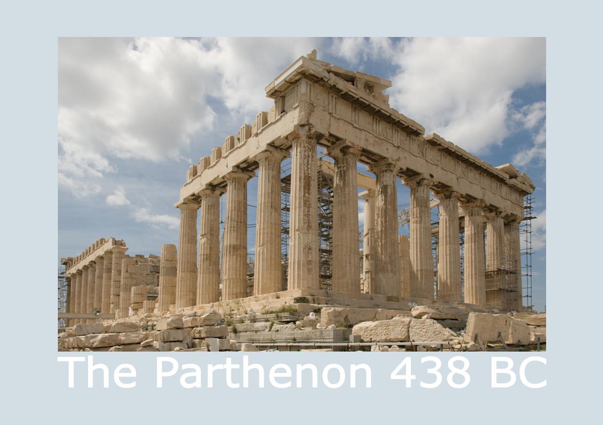
However Edith does caution the reader against going the other to extreme and discarding things because they are old fashioned. Using the Golden Mean as a guide will make it easier to furnish rooms. the Golden Mean sometimes referred to as the Golden Section is a measurement used by the Ancient Greeks.
They believed using the measurements in building and design create perfect proportion. The ratio used 0.618 to 10. A rough example is to use 1/3 of 10 =3.3, 3.3 x 2 = 6.6 which works out around 2/3rds. The what some call the perfect number is thought to have been used in various buildings, The Parthenon, Taj Mahal and the Great Mosque of Kairouan. If you visit this link you will find information on the replica of Parthenon in Nashville http://www.nashville.gov/parthenon/
“… to penetrate the mystery of house furnishing it is only necessary to analyze one satisfactory room and notice, wherein its charm lies”
The era in which Edith was writing this book was a time of great change. The new rich middle classes had money to spend. They wanted to appear cultured and accepted by the old moneyed families. To achieve this they used cheaper imitations of past styles. The higher classes held on to the traditions of the past. It was against this trend Edith spoke out.
New decorating styles were emerging; Art Nouveau and the Arts and Craft movements. Edith appears to have wanted to bring balance. A lot of what Edith had to say is still relevant today. Are people still following fashion trends at the expense of comfort, individuality and good design?
Enjoyed Starck’s Design for Life program so much this week. Philippe continued his search for a new generation of design talent. He states his aim as; ‘to encourage designers to design with the aim of helping their society to a better life’.
This week four designs were turned into prototypes. Before a product can be considered for this stage of the design process a company would need to really believe in the possibility of success. Creating a prototype is big investment in a design idea.
The company selected to create the prototypes have worked with Starck for twenty years. John Philippe has developed many of Starck’s famous designs. The students were sent off to improve their design ideas. Jess was instructed to find a material suitable for her self defense glove. She was instructed to make the glove look good/ fashionable.
Ilsa needs to turn her mobility aid idea into a workable design. Trevor’s child’s stool needs to be developed further to become less complicated. Mike’s dining setting for the visually impaired needs to be more stylish. The students are encouraged to find solutions to design problems. Ilsa works on the function and safety of the aid. She visits a group of ladies looking for the main points of function.
Trevor must simplify his design to survive in the competition. He works on a mechanism with a pushdown clink in moving motion to be moved using the hand. Mike spends his time working on creating a stylish design of his setting.
Think like designers, designers find solutions
Starck wants the last detail considered in each design. The students need to work and think like designers. Designers find solutions. Designers need to hold onto their design ideals.
Branding
The students are required to create a brand. Great branding creates a promise, then an experience, then a memory. This is a brilliant way of explaining the ideals of branding a product or service.
Aim of Branding
To creates a promise
Then an experience
Then a memory
Market research is a vital activity needed to develop a brand. Students need to find a name, logo and develop some graphic designs to promote their product.
Presentation of Branding Ideas
Ilsa presents her ideas in a complicated fashion and takes too long. This means her ideas are not clearly expressed. Mike reveals his branding ideas quickly with little detail. His branding ideas are not positively received. Jess also gives a very short presentation the name she has selected considered no good. Trevor’s name for his product ‘Move Me’ is well received and his colour selections thought to be intelligent.
The way the students presented their ideas could have been greatly improved. At this stage Ilsa’s brilliant design could be scraped. If the competition was determined by this she could well lose her place. Trevor gets the most positive feedback. This indicates the importance of design presentation.
Tips to help you present your design ideas
It is so important to be able to successful sell your design ideas. Listed below are some tips to help you present your ideas successfully.
Use short point form statements not long sentences
Do not use the words I, me or my. When you use the words I, me or my it tends to indicate a personal opinion. You are presenting a professional well thought out design solution not a personal preference.
Use clear uncomplicated visuals. Create visuals that can be viewed easily and interrupted without needing to be explain. They need to be self explanatory.
Believe in your ideas
Present your ideas with confidence and passion
Be prepared for questions
Clear concise presentations can sell your design ideas
The prototypes are revealed
What an exciting moment for these budding product designers. Ilsa’s mobility aid is stunning and very well received. She appears to be the clear winner. Jess and Trevor arecriticised because they have not evolved as designers. Mike wins a place in the final. He achieves this on the basis of his helping people design idea not on his presentation or the prototype.
Famous product designer Starck continues his journey to find the best young creative talent in Britain. As I watched this episode I was amazed to discover I had missed an episode. The weeks go by so quickly. Apparently in the last episode Starck nearly eliminated all the contestants.
The budding product designers had badly underestimated the real design task set by Starck. He complained they presented vague notions and confused concepts. He wanted clearly defined ideas with technical drawings. All the students appeared upset and angry some making statements like ‘His is only one man’s opinion’ ‘He does not clearly explain what he wants’ ‘His feedback on our design proposals was in adequate’
I remember one of my first bosses being similar to Starck. I was sixteen and working in a big dental practice. I planned to work as a dental nurse until I was old enough to get into nursing at the age of eighteen. As a junior dental nurse I worked in surgery one with the head nurse. Unfortunately the senior nurse left a few weeks after I started work. This was not an unusual occurrence, in this dental practice nurses who worked in surgery one did not last long. I was left on my own with a nightmare of a boss.
Like Starck he had high expectations, yet did not clearly express his requirements. The nurse was expected to know what he wanted without him saying a word. I learnt a great deal from this experience. Each night I went home with the patient list with the each required treatment noted. Using the dental nurse’s handbook I worked out the instruments and materials required for each treatment. I also talked with his former nurses who explained how he liked things done. With fear and trembling I started each day early. I set up the surgery treatment trays got all the materials ready and had lists of each procedure written out ready to view.
Fear can be a great motivator. I had to learn to sink or swim and very quickly. To the amazement of the boss (and myself I might add) I swam very well. He ended up having great respect for me and would make comments like “I expect my nurses to be two steps ahead of me, but see this little thing she is ten steps ahead of me”
Hard work, showing initiative and going the extra mile will always bring positive results. Strack had the same effect on the student designers as my boss had on me. They rose to the challenge when they were given a second chance with the design brief.
Four designs have been selected to be created as proto types. Unfortunately four students were sent home.
In my last year at school many of my friends wanted to be secretaries. My best friend’s sister worked in London and was earning a very good salary as a secretary. My friend talked me into doing some night classes in shorthand and typing. I hated it and was dreadful at both. Instead of turning up at the classes I would sneak into the art classes. Alas my parents found out and my evening classes were abruptly stopped.
It amazes me now to think of those long ago days. If only I had learnt those skills I would have saved myself a lot of trouble. I never did learn to type as my Mum would say ‘the proper way’ In spite of the lack of professional skill I can type at a moderate speed. I did after all learn (asdf space ;lkj space) the first line and I am not a one finger typist.
These days there are very few secretaries around and many professionals need to write business letters. Over the years I have tried to develop my writing skills. I have completed many courses of study and been complemented on my writing. But I can still feel a wee bit inadequate and wish I had finished those classes many years ago.
I am always looking for ways to improve my writing so keep an eye out for informative books and websites. It is an ongoing process. I have also worked with others to help them improve their business letters and resumes. There has been a move away from the strict rules of yesteryear with the advent of advances in technology. However it is important to present a professional image and learn some tips and tricks for writing business letters.
Letters today need to be well crafted and concise. Job applicants are often advised to keep the covering letter of their resume to one page if possible. It is also a goal to aim at when writing bussiness letters. However the writer can often find they need to flow on to another page for the last few sentences.
Shaun from Writing Help Central has a few suggestions to help writers overcome this dilemma. He suggests moving the left and right margins by 0.25cm (1/4 inch) closer to the edge of the page. You could also move the top and bottom margins closer to the edge by 0.25cm (1/4 inch). The spacing between lines can also be adjusted. Instead of the usual single 12 points try 11 points.
Changing the font from 12 points to 11 points can also be a way of getting extra space. Often you will find you can get extra space by going back and doing some tough editing. Sentences with one or two words flowing over onto another line can often be reworked to eliminate the offending words.
Sometimes two page letters are the best option. If this is the case create a well spaced easy to read professional document and you will be forgiven for breaking what is now considered by many to be the cardinal rule ‘one page business letters please’.
In the introduction of her book ‘The Decoration of Houses’ Edith Wharton sets out to sell the need for such a book. She goes back to the middle ages and explains interior decoration had to be portable because people lived in tents and castles.
When people became settled she explains architectural ornament (with what we now recognize as classical motifs, proportionand design) became part of the interior decoration of rooms. Unfortunately over the centuries architects have come to believe mouldings, architraves and cornices are insignificant detail.
At the time Edith was writing this book in the late 1890’s she argued architects now hurried over this detailing and had handed over the decoration and furnishing of rooms to the upholsterer.
The poor upholsterer is accused of being ignorant and using unscientific methods. With the result Edith states boldly home decoration is seen as a black art. There has been no study or publication on house decoration as a branch of architecture in England or America for over 50 years she states.
Edith encourages home decorators to become skilled by studying the architects of old. She firmly states “….. architectural proportion – incontradistinction to the modern view of house decoration was a part of architecture in all it’s values……”
As I read this introduction I could feel her frustration. Edith had fallen in love with Italy and lived in France. During this writing project she consulted 25 French books, 20 English books, six Italian books and four German books. Wow she obviously thought research very important. I am finding the book ‘The Decoration of Houses’ fascinating.
In this blog you will find the images I promised for those of you who have followed the link from the article ‘Hints and Tints Interior Decorating with Colour’
The images selected illustrate the points on colour discussed in the article. Images of three rooms are shown one with tinted light, cool colours showing how the colours make the rooms appear bigger due to the fact light/cool colours appear to recede.
In the second group of images the same rooms now have a mid colour. In the third group the warmer darker colours appear to advance into the rooms. The colours can make the rooms appear smaller and more intimate.
Tip: Sometimes it helps if you half close your eyes as you view the images
Many people consider colour the most important of the interior design elements. Colour can create moods, make a room appear bigger or make a room appear colder or warmer. It is a powerful interior decorating tool.
As stated in the article colours are basically light or dark, warm or cool. Light and cool colours tend to recede (when used on the walls of a room they can make the walls appear to move out) and can make a room appear bigger. Dark and warm colours appear to advance into a room and can make a room appear smaller.
You need to consider three many things when selecting colour, first is the aspect of the room. The second consideration is your personal preference and the third size and shape of the room.
If a room is large warm or dark colours can make it appear smaller. If the room is very long and narrow the short walls can be painted in a darker or warmer colour than the colour used on the longer walls. This will make to shorter walls appear to advance into the room in comparison to the longer walls, making the room appear shorter and wider.